Project Quality Management and Agile context
Project quality management is a vital aspect of project management that focuses on ensuring that a project delivers its intended outcomes with the desired level of quality. It involves processes and activities aimed at defining quality standards, ensuring those standards are met throughout the project lifecycle, and continuously improving processes to enhance quality.
Here are some key components of project quality management:
Quality Planning: This involves defining the quality standards that must be met for the project's deliverables. It includes identifying quality requirements and determining how to meet them.
Quality Assurance (QA): QA activities are focused on preventing defects by implementing processes and standards. It involves regular reviews, audits, and inspections to ensure that the project is adhering to the defined quality standards.
Quality Control (QC): QC involves monitoring and verifying that the project deliverables meet the specified quality standards. It includes activities such as testing, measuring, and validating the deliverables to identify and correct defects.
Quality Improvement: Continuous improvement is an essential aspect of project quality management. This involves analyzing quality metrics, identifying areas for improvement, and implementing changes to enhance overall quality.
Quality Metrics and Reporting: Establishing metrics to measure quality performance throughout the project and generating reports to communicate quality status to stakeholders.
Quality Management Tools: Various tools and techniques are utilized in project quality management, such as quality checklists, cause-and-effect diagrams, statistical sampling, control charts, and Six Sigma methodologies.
Customer Satisfaction: Ultimately, the goal of project quality management is to ensure that the project delivers value to the customer or end-user by meeting or exceeding their expectations for quality.
By effectively managing project quality, organizations can increase customer satisfaction, reduce rework and costs associated with defects, and ultimately improve project success rates. It's an integral part of project management that requires proactive planning, diligent execution, and a commitment to continuous improvement.

Quality Planning
Quality planning is the process of identifying the quality standards relevant to the project and determining how to satisfy them. It's a proactive approach to ensure that the project's deliverables meet or exceed the expectations of stakeholders. Here are the key steps involved in quality planning:
Identify Quality Requirements: Begin by understanding the quality requirements of the project. This involves gathering inputs from stakeholders, including customers, end-users, sponsors, and regulatory bodies. Quality requirements should be clear, measurable, and aligned with the project's objectives.
Set Quality Objectives: Based on the identified requirements, establish specific quality objectives for the project. These objectives should be realistic, achievable, and relevant to the project's scope and constraints. Quality objectives may relate to performance, reliability, usability, compliance, and other relevant factors.
Develop Quality Standards: Define the quality standards that must be met to achieve the quality objectives. Quality standards specify the criteria against which the project's deliverables will be evaluated. Standards may be based on industry best practices, regulatory requirements, organizational policies, or specific stakeholder expectations.
Create Quality Management Plan: Document the approach and methodologies that will be used to ensure quality throughout the project lifecycle. The Quality Management Plan outlines roles and responsibilities, processes for quality assurance and quality control, tools and techniques, quality metrics, and reporting mechanisms.
Identify Quality Assurance Activities: Determine the activities that will be implemented to prevent defects and ensure that quality processes are followed. Quality assurance activities may include reviews, audits, process improvements, training, and compliance assessments.
Define Quality Control Measures: Specify the measures and techniques that will be used to verify that project deliverables meet the defined quality standards. Quality control measures may include testing, inspections, peer reviews, sampling, and statistical analysis.
Allocate Resources: Ensure that adequate resources, including personnel, time, and budget, are allocated to support quality planning and execution activities. Resources should be sufficient to implement quality assurance and quality control processes effectively.
Communicate Quality Plans: Clearly communicate the quality objectives, standards, and processes to all project stakeholders. Ensure that team members understand their roles and responsibilities related to quality management and are committed to achieving quality goals.
Monitor and Update: Continuously monitor the project's adherence to quality plans and standards throughout the project lifecycle. Evaluate the effectiveness of quality assurance and quality control activities and make adjustments as needed to address any deviations or opportunities for improvement.
By conducting thorough quality planning, project teams can establish a solid foundation for delivering high-quality outcomes that meet stakeholder expectations and contribute to project success.
A Quality Management Plan (QMP) is a document that outlines the quality assurance (QA) and quality control (QC) activities to be implemented throughout a project's lifecycle. It serves as a roadmap for ensuring that project deliverables meet the specified quality standards and requirements. Here are the key components typically included in a Quality Management Plan:
Introduction and Purpose: This section provides an overview of the purpose and objectives of the Quality Management Plan, including its scope and intended audience.
Project Overview: Describe the project in terms of its objectives, scope, stakeholders, and deliverables. This section helps provide context for the quality management activities outlined in the plan.
Quality Objectives: Specify the quality objectives that the project aims to achieve. These objectives should be specific, measurable, achievable, relevant, and time-bound (SMART).
Quality Standards and Requirements: Detail the quality standards and requirements that apply to the project. This may include industry standards, regulatory requirements, organizational policies, and stakeholder expectations.
Roles and Responsibilities: Define the roles and responsibilities of team members involved in quality management activities. This includes roles such as Quality Manager, Quality Assurance Team, Quality Control Inspectors, and project team members responsible for implementing quality processes.
Quality Assurance Activities: Outline the activities and processes that will be performed to ensure that quality requirements are met throughout the project lifecycle. This may include: Quality planning activities, Process audits and reviews, Training and skill development, Compliance assessments, Documentation management
Quality Control Measures: Describe the techniques and procedures that will be used to verify that project deliverables meet the specified quality standards. This may include: Testing and inspection procedures, Quality control checklists, Statistical sampling methods, Verification and validation processes
Quality Tools and Techniques: Identify the tools, methodologies, and techniques that will be utilized to support quality management activities. This may include: Quality management software, Root cause analysis tools, Six Sigma or Lean methodologies, Quality control charts and graphs
Quality Metrics and Reporting: Define the metrics that will be used to measure quality performance and establish reporting mechanisms to communicate quality status to stakeholders. This may include: Key Performance Indicators (KPIs), Quality dashboards and reports Frequency and format of quality reviews and updates
Change Management Process: Describe how changes to the project scope, requirements, or deliverables will be assessed and managed to ensure they do not compromise quality objectives.
Risk Management: Identify quality-related risks that may impact the project and outline mitigation strategies to address them.
Documentation and Deliverables: Specify the documentation and deliverables related to quality management that will be produced during the project, including quality plans, reports, and audit findings.
Appendices: Include any supplementary information or supporting documents relevant to the Quality Management Plan, such as templates, guidelines, or references.
The Quality Management Plan should be a dynamic document that is reviewed and updated regularly throughout the project lifecycle to ensure that quality management activities remain effective and aligned with project objectives. It should also be communicated to all relevant stakeholders to ensure understanding and buy-in to the quality processes and expectations.

7 Quality Control Tools
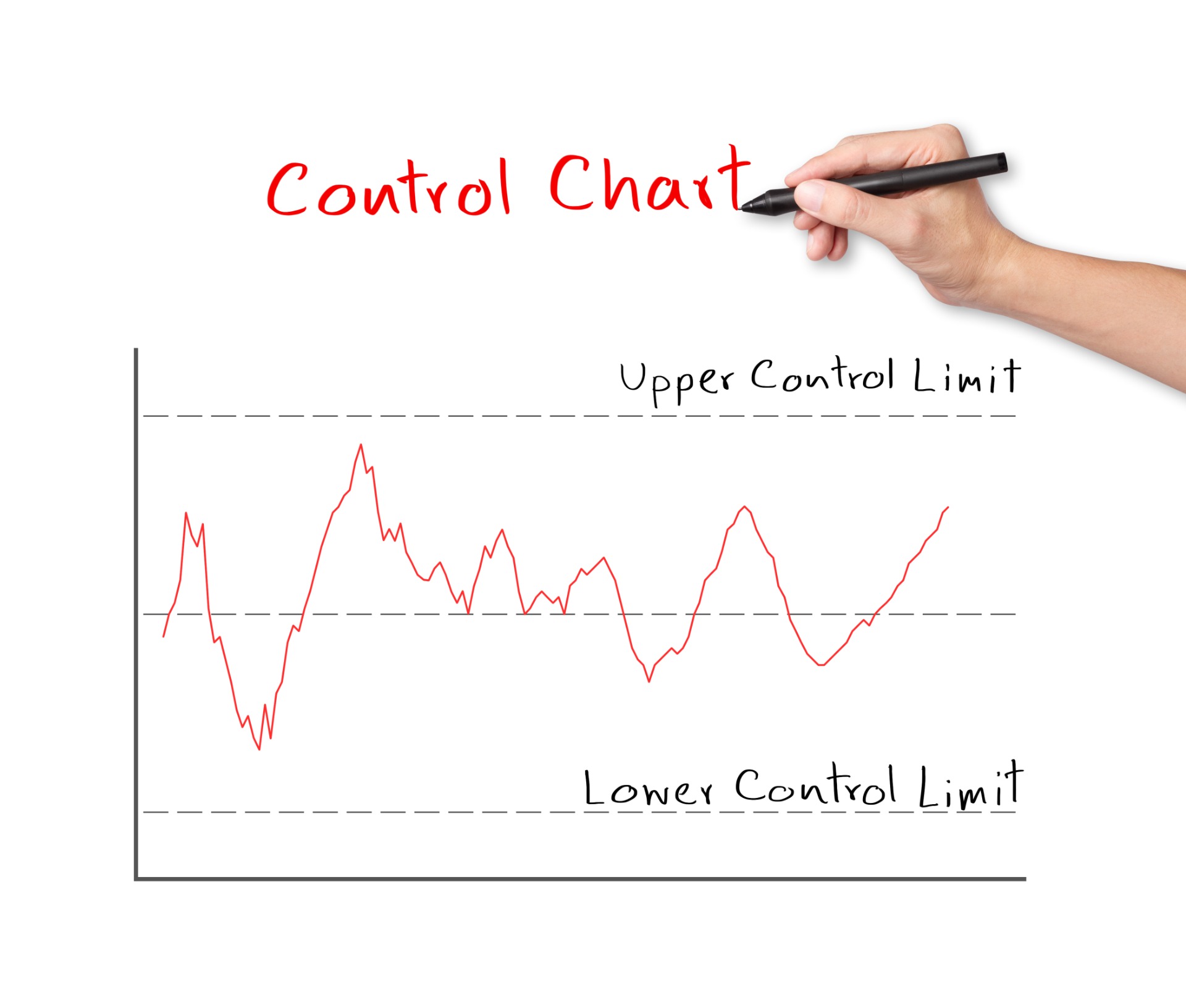
Control charts are graphical tools used in statistical process control (SPC) to monitor and analyze the performance of a process over time. They help identify variations, trends, and patterns in process data, allowing organizations to distinguish between common cause variation (inherent to the process) and special cause variation (resulting from external factors or assignable causes).
In control chart terminology, "out of control points" refer to data points that fall outside the control limits or exhibit patterns that indicate special cause variation. Control limits are statistical boundaries that are typically set at a certain number of standard deviations from the process mean and serve as indicators of the normal variability expected in a stable process. When data points exceed these limits or exhibit specific patterns, it suggests that the process may be experiencing special cause variation, which requires investigation and corrective action.
The "Rule of Seven" is a guideline used in statistical process control (SPC) to help identify patterns or shifts in data points on control charts that may indicate special cause variation. This rule states that if seven consecutive data points fall on the same side of the mean (above or below), excluding any points that touch the mean or fall within one standard deviation of the mean, then the process is likely out of control.
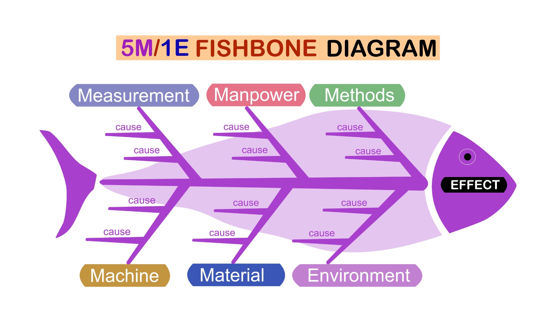
A Fishbone diagram, also known as a Ishikawa diagram or Cause-and-Effect diagram, is a visual tool used to identify and analyze potential causes of a specific problem or effect. It is named after its inventor, Kaoru Ishikawa, a Japanese quality control expert.
The diagram is called a Fishbone diagram because of its appearance, resembling the skeletal structure of a fish. The problem or effect being analyzed is depicted as the "head" of the fish, while the "bones" branching off from it represent different categories of potential causes.
Here's how to create and use a Fishbone diagram:
Identify the Problem: Clearly define the problem or effect that you want to analyze. This should be stated concisely and placed at the head of the diagram.
Determine Categories of Causes: Identify the main categories of potential causes that could contribute to the problem. Common categories often used include: People: Human factors such as skills, training, or motivation. Process: Procedures, methods, or workflows related to the problem. Machines: Equipment, tools, or technology involved in the process. Materials: Raw materials, supplies, or resources used in the process. Environment: Physical or external factors such as temperature, lighting, or workspace conditions. Measurement: Metrics, data collection methods, or analysis techniques.
Draw the Spine and Branches: Draw a horizontal line extending from the head of the fishbone to represent the spine. Then, draw angled lines (the "bones") branching off from the spine to represent each category of causes identified in step 2.
Brainstorm Causes: Within each category, brainstorm potential causes or factors that could contribute to the problem. Write these causes as sub-branches extending from the corresponding bone.
Analyze and Prioritize Causes: Review the identified causes and analyze their potential impact on the problem. Consider factors such as likelihood, severity, and controllability. Prioritize the most significant causes for further investigation or action.
Take Action: Use the Fishbone diagram as a tool to guide problem-solving efforts. Address the root causes identified and implement corrective actions to mitigate or eliminate the problem.
Continuously Improve: Monitor the effectiveness of the corrective actions taken and track any changes in the problem or effect over time. Use feedback and data to refine the Fishbone diagram and improve problem-solving processes.
By using a Fishbone diagram, teams can systematically analyze complex problems, identify root causes, and develop targeted solutions to address them effectively. It promotes collaboration, creativity, and structured problem-solving within organizations.
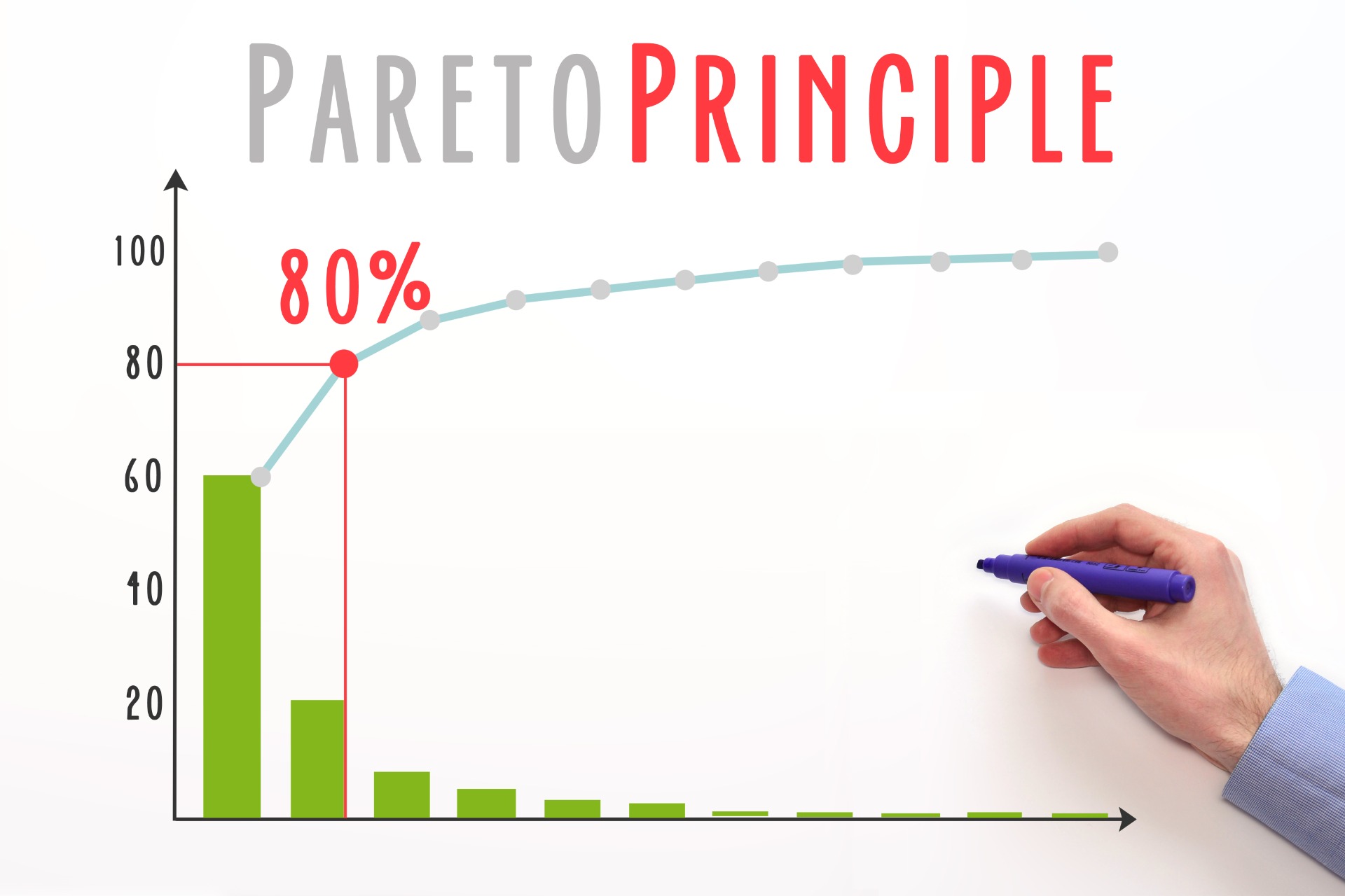
A Pareto chart, named after the Italian economist Vilfredo Pareto, is a type of chart that combines both bar and line graphs to represent categorical data in descending order of frequency, along with a cumulative percentage line. It's commonly used in quality management and problem-solving to identify the most significant factors contributing to a problem or effect.
A Pareto chart and the 80/20 rule (also known as the Pareto Principle) are closely related concepts, both derived from the work of Italian economist Vilfredo Pareto. While they are related, they serve slightly different purposes:
Pareto Principle (80/20 Rule): The 80/20 rule, or the Pareto Principle, states that roughly 80% of the effects come from 20% of the causes. In other words, a significant portion of the outcomes (80%) is typically driven by a relatively small number of inputs or factors (20%). This principle is applied in various fields, including economics, business, and quality management, to prioritize efforts and resources based on the most significant contributors to the desired outcomes. For example, in business, it might mean that 80% of a company's revenue comes from 20% of its customers, or that 80% of problems in a process are caused by 20% of the factors.
Pareto Chart: A Pareto chart is a graphical tool used to visualize the relative importance of different factors or categories based on their frequency or impact. It combines both bar and line graphs to represent categorical data in descending order of frequency, along with a cumulative percentage line. The categories are typically ordered from the most frequent to the least frequent, and the chart helps identify the "vital few" factors that contribute the most to the total. A Pareto chart is often used to apply the Pareto Principle in practice, as it allows practitioners to focus efforts on addressing the most significant contributors to a problem or effect.
While the 80/20 rule provides a guiding principle for understanding the distribution of effects and causes, a Pareto chart is a practical tool for visualizing and applying this principle in real-world situations. By using Pareto charts, organizations can identify and prioritize areas for improvement, allocate resources effectively, and achieve maximum impact with limited resources.
Flow charts : Flowcharts are graphical representations of processes or workflows, commonly used in various fields such as software development, engineering, business, and education. They consist of different shapes and arrows that illustrate the sequence of steps in a process. Here's a breakdown of the basic components typically found in flowcharts:
Start/End: Represented by an oval or rounded rectangle, this shape signifies the beginning or end of a process. It usually contains the word "Start" or "End."
Process: Represented by a rectangle, this shape denotes a task or action to be performed in the process. It contains a brief description of the action.
Decision: Represented by a diamond shape, this shape indicates a point in the process where a decision needs to be made. The process flow can diverge based on the decision. Labels on the arrows leaving the decision shape typically describe the conditions that determine the flow path.
Input/Output: Represented by a parallelogram, this shape denotes input or output of data from/to the process.
Connector: Represented by a small circle, this shape is used to connect different parts of a flowchart when lines cross each other.
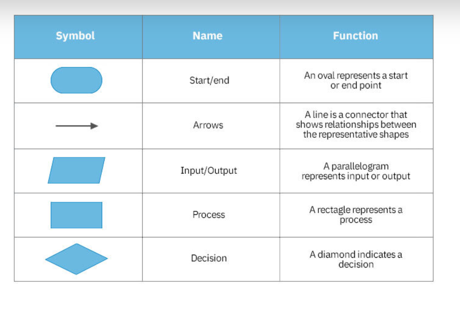
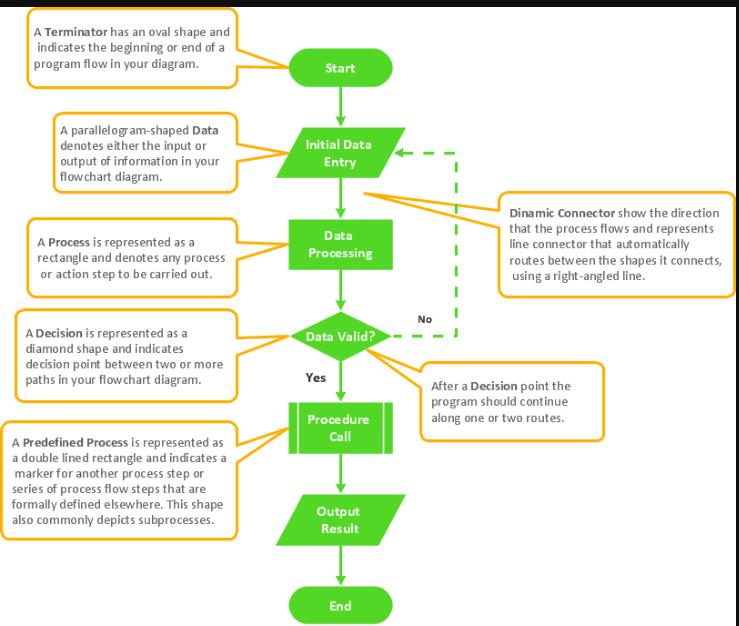
Flowcharts are valuable for visualizing processes, identifying potential bottlenecks or inefficiencies, and communicating complex procedures in a clear and understandable manner. They can range from simple representations like the one above to highly detailed diagrams for intricate processes.
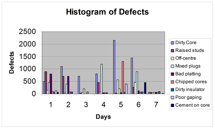
Histograms : A histogram is a graphical representation of the distribution of numerical data. It consists of a series of contiguous rectangles, or bars, each representing a range or category of values, and the height of each bar corresponds to the frequency or relative frequency of data points falling within that range.
Here's a breakdown of the key components of a histogram:
X-Axis (Horizontal Axis): This axis represents the range of values or categories of the data being analyzed. It is divided into intervals or categories, and each interval corresponds to a bar in the histogram.
Y-Axis (Vertical Axis): This axis represents the frequency or relative frequency of data points falling within each interval or category on the X-axis. The height of each bar indicates how many data points fall within that interval or category.
Bars: These are the rectangular columns that represent the data. The width of each bar typically corresponds to the width of the interval or category on the X-axis, and the height of the bar represents the frequency or relative frequency of data points falling within that interval or category.
Histograms are often used to visually represent the distribution of continuous data, such as measurements or scores, and they provide insights into the central tendency, spread, and shape of the data distribution. They are particularly useful for identifying patterns, outliers, and potential data anomalies.
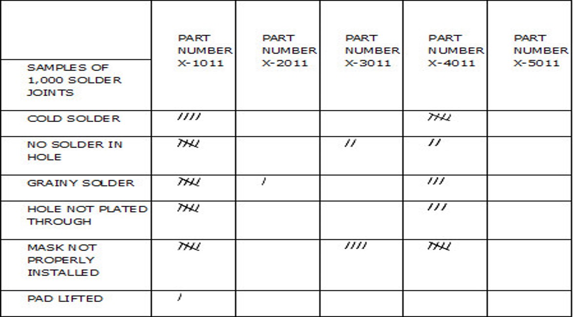
Check sheets, also known as tally sheets or frequency distribution sheets, are simple tools used for collecting and organizing data in a structured format. They are particularly useful for capturing and summarizing the frequency of occurrences of specific events or types of defects in a process. Check sheets can be created manually on paper or using digital tools like spreadsheets.
Here's how a basic check sheet is typically structured:
Header: This section includes information such as the title of the check sheet, the date of data collection, the name of the person collecting the data, and any other relevant details.
Categories/Items: Check sheets are designed to capture data on specific categories or items of interest. Each category or item is listed in a column or row, depending on the layout of the check sheet.
Tally Marks: For each category or item, tally marks or other symbols are used to record the occurrences or counts. Each mark typically represents one instance of the event or type of defect.
Total/Summary: At the end of data collection, the total counts for each category or item are calculated and summarized, providing insights into the distribution or frequency of occurrences.
Check sheets can be customized based on the specific requirements of the data collection process. They are commonly used in quality control, process improvement, and problem-solving initiatives to identify trends, patterns, or areas for improvement.
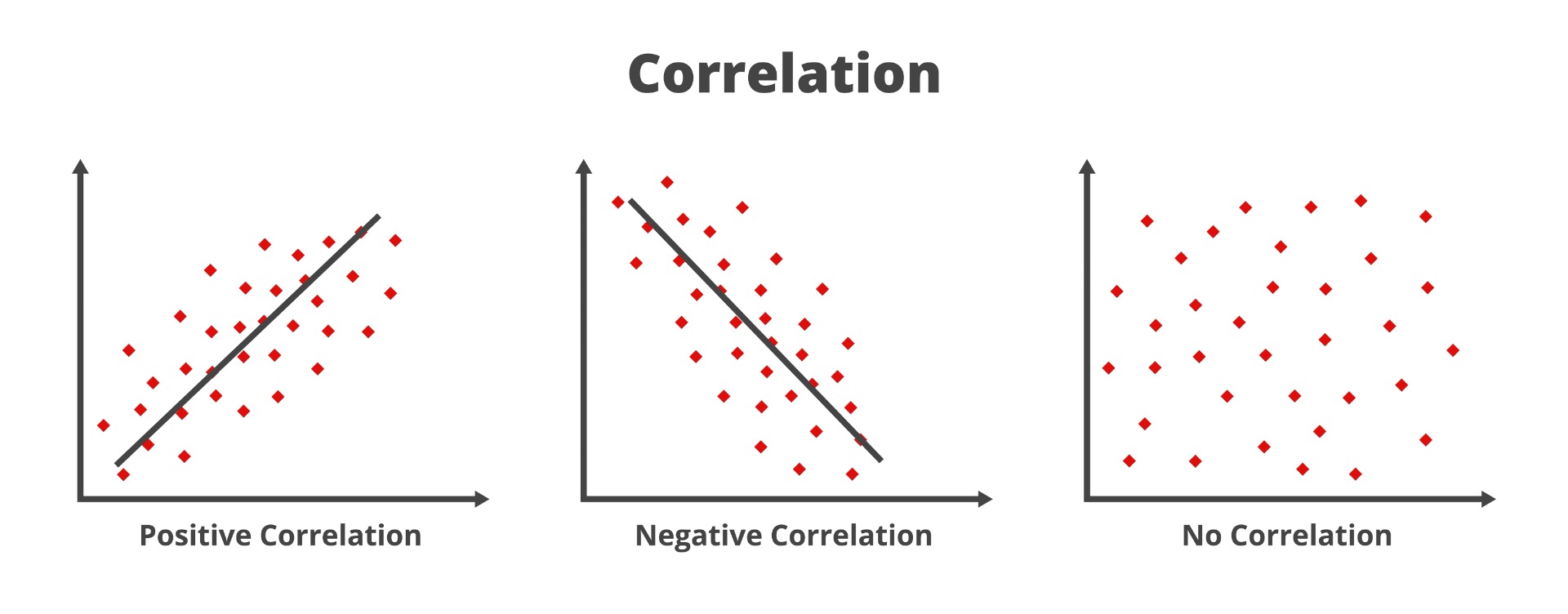
A scatter diagram, also known as a scatter plot, is a graphical representation of the relationship between two variables. It displays individual data points as dots on a Cartesian plane, with one variable represented on the horizontal axis (X-axis) and the other variable represented on the vertical axis (Y-axis). Scatter diagrams are particularly useful for visually identifying patterns, trends, correlations, or relationships between two variables.
Here's a breakdown of the key components of a scatter diagram:
X-Axis (Horizontal Axis): This axis represents one of the variables being analyzed. It typically spans the range of values observed for that variable in the dataset.
Y-Axis (Vertical Axis): This axis represents the other variable being analyzed. Like the X-axis, it spans the range of values observed for that variable in the dataset.
Data Points: Each data point on the scatter diagram represents a single observation or measurement of the two variables being analyzed. The position of the data point on the X-Y plane corresponds to the values of the variables for that observation.
Trend Line (Optional): In some cases, a trend line may be added to the scatter plot to visually illustrate the overall trend or relationship between the two variables. This line may be a simple linear regression line or another type of trend line that best fits the data.
Scatter diagrams are commonly used in various fields, including statistics, engineering, science, finance, and social sciences. They are particularly valuable for:
- Exploring the relationship between two variables.
- Identifying patterns or trends in the data.
- Assessing the strength and direction of correlations between variables.
- Detecting outliers or unusual observations.
- Making predictions or forecasting based on observed relationships.
20 Multiple-Choice Questions (MCQs) on Project Quality Management
1. What is the primary purpose of Project Quality Management?
a) To complete the project as quickly as possible
b) To ensure that the project meets stakeholder expectations and requirements
c) To maximize project costs
d) To increase project risks
✅ Answer: b
📌 Explanation: Project Quality Management ensures that project deliverables meet agreed quality requirements, reducing defects and increasing customer satisfaction.
2. Which of the following is NOT a process in Project Quality Management?
a) Plan Quality Management
b) Manage Quality
c) Control Quality
d) Conduct Procurement
✅ Answer: d
📌 Explanation: **"Conduct Procurement" belongs to Procurement Management. The three main processes in Quality Management are Plan Quality Management, Manage Quality, and Control Quality.
3. What is the main objective of the "Plan Quality Management" process?
a) To define quality standards and how they will be met
b) To correct defects after project completion
c) To test project deliverables before client acceptance
d) To increase project costs
✅ Answer: a
📌 Explanation: Plan Quality Management focuses on defining quality standards, metrics, and compliance strategies before execution.
4. What is the difference between "Manage Quality" and "Control Quality"?
a) Manage Quality focuses on processes, while Control Quality focuses on deliverables
b) They are the same
c) Control Quality occurs before Manage Quality
d) Manage Quality is only needed for large projects
✅ Answer: a
📌 Explanation: Manage Quality ensures processes and practices support quality objectives, while Control Quality verifies deliverables against quality requirements.
5. Which tool is used to analyze the root cause of a quality problem?
a) Gantt Chart
b) Fishbone Diagram (Ishikawa)
c) Critical Path Method
d) Pareto Chart
✅ Answer: b
📌 Explanation: The Fishbone Diagram (Ishikawa Diagram) helps identify root causes of defects by categorizing factors affecting quality.
6. Which of the following best describes "Cost of Quality (CoQ)"?
a) The total cost of preventing, detecting, and correcting defects
b) The project's overall budget
c) The cost of implementing project scope
d) The total cost of stakeholder engagement
✅ Answer: a
📌 Explanation: Cost of Quality includes prevention, appraisal, and failure costs related to ensuring deliverable quality.
7. Which of the following is an example of Appraisal Cost in Cost of Quality?
a) Training employees
b) Conducting inspections and testing
c) Reworking defective products
d) Providing customer refunds
✅ Answer: b
📌 Explanation: Appraisal costs involve measuring, evaluating, and auditing deliverables to detect defects before reaching customers.
8. What does "Six Sigma" aim to achieve in quality management?
a) 100% perfection in deliverables
b) Reduction of defects to 3.4 per million opportunities
c) Faster project execution
d) Increased project costs
✅ Answer: b
📌 Explanation: **Six Sigma focuses on minimizing defects by improving processes and reducing variability, aiming for 3.4 defects per million opportunities.
9. What is the purpose of a Pareto Chart in Quality Management?
a) To show project schedule delays
b) To prioritize quality issues based on frequency
c) To track project costs
d) To list project risks
✅ Answer: b
📌 Explanation: Pareto Charts use the 80/20 rule to identify the most frequent causes of defects, allowing teams to focus on solving major issues first.
10. Which technique is used for continuous process improvement in quality management?
a) Monte Carlo Simulation
b) Kaizen
c) Fast Tracking
d) Resource Leveling
✅ Answer: b
📌 Explanation: Kaizen is a Japanese philosophy that emphasizes continuous process improvement through small, incremental changes.
11. The "Rule of Seven" in quality control is associated with which tool?
a) Control Charts
b) Risk Register
c) Work Breakdown Structure
d) Earned Value Management
✅ Answer: a
📌 Explanation: The Rule of Seven in Control Charts suggests that if seven consecutive points fall on one side of the mean, the process is out of control.
12. Which tool is used to compare the actual project performance against planned quality standards?
a) Flowchart
b) Control Chart
c) Gantt Chart
d) Decision Tree
✅ Answer: b
📌 Explanation: Control Charts help monitor process stability and detect variations from planned quality performance.
13. What is a key benefit of Total Quality Management (TQM)?
a) Focus on preventing defects rather than fixing them
b) Increasing project scope
c) Reducing stakeholder involvement
d) Eliminating all project risks
✅ Answer: a
📌 Explanation: TQM emphasizes continuous improvement, customer satisfaction, and defect prevention rather than detection and correction.
14. Which quality management principle does ISO 9001 emphasize?
a) Customer focus and continuous improvement
b) Increasing project complexity
c) Minimizing stakeholder communication
d) Reducing project timelines
✅ Answer: a
📌 Explanation: **ISO 9001 focuses on customer satisfaction, leadership involvement, and continuous process improvement.
15. Which of the following represents an external failure cost in Cost of Quality?
a) Training employees
b) Reworking defective products before delivery
c) Providing warranty claims for defective products
d) Conducting quality audits
✅ Answer: c
📌 Explanation: **External failure costs occur when defects reach customers, leading to warranty claims, returns, or reputational damage.
16. Which quality control tool is best suited for identifying patterns in process performance over time?
a) Fishbone Diagram
b) Control Chart
c) Stakeholder Register
d) Monte Carlo Analysis
✅ Answer: b
📌 Explanation: Control Charts track process variations over time to determine whether a process is in statistical control.
17. What does a Histogram represent in Quality Management?
a) Frequency distribution of data points
b) Project timeline and milestones
c) Risk probability and impact
d) Earned Value calculations
✅ Answer: a
📌 Explanation: A Histogram shows the distribution of quality data points, helping identify defect patterns and variations.
18. Which process ensures that quality activities comply with organizational standards and policies?
a) Plan Quality Management
b) Manage Quality
c) Control Quality
d) Close Project
✅ Answer: b
📌 Explanation: Manage Quality ensures that processes and standards are followed to meet project quality requirements.
19. What is "Benchmarking" in quality management?
a) Comparing project performance against industry best practices
b) Testing project deliverables
c) Creating a project schedule
d) Assigning quality control tasks
✅ Answer: a
📌 Explanation: Benchmarking involves comparing project quality metrics with industry best practices to identify improvement opportunities.
20. Which document records quality metrics and test results?
a) Quality Management Plan
b) Risk Register
c) Quality Audit Report
d) Lessons Learned Register
✅ Answer: c
📌 Explanation: The Quality Audit Report documents test results, compliance findings, and recommendations for process improvements.
